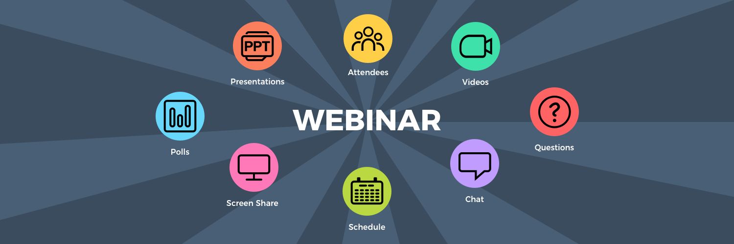
nunify™ follows flat minimalist design – a design approach that emphasises usability. Our platform is clean, open space, crisp, bright colours and 2D to make it easy-to-use for webinars & virtual events. We reduce clutter, unwanted distractions and provide familiar interface attendees are used to. Our creative team thoughtfully analyses all design elements and removes those that serve no functional purposes.
However, given that nunify™ is a webinar & event platform we are aware of the need of colorful flamboyant elements. We also understand the need for “realism”. But studies have shown avatars & 3D elements – especially if not done to the gold standard set by video games perform extremely poorly.
Here are 7 more reasons why flat minimalist design is a MUST HAVE for virtual event & webinar platforms
- Low learning curve : Attendees, Speakers, Hosts and your staff are already used to watching movies online, browsing e-commerce sites, engaging in social apps etc., so they are already familiar with the interaction elements of our platform
- Declutter information : An event usually has lots of content that is created by speakers, users and exhibitors. And it is easy to get lost in 3D platforms where it becomes hard to differentiate between “content” vs “environment”
- Intuitive Networking : Do you see a 3D virtual person – when you chat on whatsapp ? or talk to customer care using chatbot? or speak to family & friends on instagram? We provide familiar interfaces to ensure the focus remains on networking
- Better Sponsor & Exhibitor ROI: Your exhibitors create lots of creative dynamic visuals which should be the focus, not distracting “auditoriums” or fake “booth hosts” or cartoony “lobby”. Our clients have seen 125% better click-through rates compared to when they have used 3D environments
- You can brand in 2D too : We know every event needs its own brand. We have blended the best of both worlds – the functionality of webinars & visuals of virtual events to provide lots of branding opportunities. Contact us to know more.
- Minimalist does NOT mean boring: nunify™ allows you to upload dynamic content from videos to gifs and bright bright, contrasting colours. This allows illustrations and buttons pop from backgrounds to easily grab attention, and guide the attendee’s eye
- Turn-key solution & low support costs : Yes, you can go live within minutes. No need for weeks or months of turn-around time to get the “3D environment right”. Even better is nunify™ backend is DIY and all your updates are live instantly
To conclude, we know the event industry is going through an unprecedented adoption of online technology due to the unfortunate COVID19 cancellations. Hence it becomes critical to learn from other verticals who transformed “online” – from Amazon to Facebook to Instagram to LinkedIn to Yelp/Zomato to Uber none of them are 3D environments – are they?
So don’t reinvent the wheel, instead lets innovate from web & app designs that are familiar, intuitive and user friendly.


